Table of Contents
ToggleHow to Design Modern, Minimalist, Business Logo Design
Ready to create a logo design that speaks volumes about your brand?
Unleash Your Logo Magic, Professional Best Logo design: Mastering Modern, Minimalist, and Business-Oriented Designs
Learn how to design modern, minimalist, and business logo designs that leave a lasting impression.
Welcome to the captivating world of logo design, where art meets communication, and magic is woven into every stroke.
Whether you’re a business owner, a startup enthusiast, or a creative dreamer, we’ve got the ultimate guide to elevate your logo game and establish a strong brand identity.
In this thrilling journey, we’ll delve into the secrets of modern logo trends that sweep people off their feet. Clean lines, sharp geometric shapes, and mesmerizing negative space are just a taste of what awaits you.
Get ready to embrace the power of minimalism, where less is more, and elegance reigns supreme. Whisper volumes with a single stroke, and leave a mark that’s etched in memory.
Your logo is your brand’s superhero—a badge of honor and a first impression maker. It’s got to connect with your audience, embody your brand’s values, and shine like a beacon in the design universe. But fear not! We’re here to guide you through the creative process, from research and brainstorming to digitalization and testing.
Unleash your creativity, embrace modern design principles, and create logos that stand the test of time.
Let’s make logo magic happen! ➡️:Here:
In today’s fast-paced and ever-changing business world, your logo is your superhero cape, your badge of honor, and your trusty sidekick, all rolled into one.
It’s not just a pretty picture; it’s the heart and soul of your brand, and getting it right is nothing short of an art.
Have you ever wondered why some logos are etched in your memory forever while others fade away like a forgotten dream? Well, my friends, it all boils down to the magic of modern, minimalist, and business-oriented logo design.
And here’s the scoop: we’ve got the inside secrets to make your logo shine like a beacon in the design universe!
So, what’s the fuss about modern logos? Picture this: clean lines that flow like a gentle breeze, colors that dance like fireworks on a starry night, and a touch of geometric elegance that’s simply mesmerizing.
That’s what makes modern logos a cut above the rest.
But wait, we’re not stopping there! The world of minimalist logos beckons with its timeless charm and sheer elegance.
These little wonders work their magic with less fuss and more finesse. Oh, how they whisper volumes with a single stroke!
And when it comes to your business, darling, your logo is the VIP guest at the grand gala. It’s your brand ambassador, your first impression maker, and your loyal advocate.
It’s got to speak your language, connect with your audience, and embody the very essence of your brand.
But hey, don’t you worry!
We’ve got your back with the ultimate logo design guide. From uncovering the hidden gems of modern logo trends to embracing the power of minimalism, we’ll take you on a creative journey that’s as thrilling as a roller coaster ride!
And that’s not all! We’ll hold your hand through the logo design process, revealing the tricks of the trade, and spilling the beans on how to make your logo shine brighter than the North Star.
So, fellow adventurers, grab your creative hats, fasten your seatbelts, and get ready for an unforgettable logo design extravaganza. Together, we’ll paint the canvas of modern, minimalist, and business-oriented logo design, and your brand will steal the spotlight like never before.
Buckle up, logo dreamers, because we’re about to make logo magic happen! Let’s dive into the captivating world of modern, minimalist, and business logo design and create logos that’ll leave a trail of stardust wherever they go.
Are you ready to unleash the artist within and bring your brand’s story to life? Let’s do this!
Understanding the Art of Modern Logo Design
What Makes a Logo Modern Design?
So, what’s the secret sauce behind modern logos that makes ’em oh-so-amazing? Let’s spill the beans! First off, simplicity is the bee’s knees! Modern logos sweep people off their feet with clean lines and nix the jumble-jumble. No clutter, no worries!
And hey, geometric shapes are all the rage! Circles, squares, triangles—they’re the VIPs of contemporary design. Think sharp, think sleek, and voilà, you’re in business!
Psst, ever heard of negative space? It’s the magician’s trick in logo design. Play with those empty spaces, and you’ll create logos with depth and mystery, leaving folks wondering, “How’d they do that?”
Colors That Pop
Hold up, you want your logo to scream “Look at me!” right? That’s where colors come in, pal! Go bold, go vibrant, and go for hues that connect with your peeps.
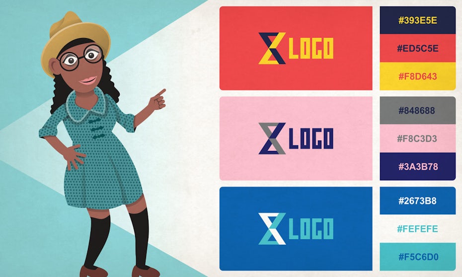 Illustration by Vladanland
The Essence of Modern Minimalist Design Logos
Less Is More
Ah, the minimalist way—the ultimate trendsetter! These logos are like a whisper in the wind but trust us, they leave a mark that’s tough to forget. Say bye-bye to frills and fancies, and hello to pure elegance!
The Power of Minimalist Logos
In the world of logo design, the minimalist approach is a true trendsetter, embracing simplicity and elegance to create logos that leave a lasting impact.
Less Is More is not just a design philosophy; it’s an art form that strips away unnecessary elements, frills, and complexities, focusing on the essentials to convey a brand’s identity with remarkable clarity and sophistication.
These understated logos may be like a whisper in the wind, but their subtle charm and strong visual presence make them unforgettable.
Example of Minimalist Logo Designs:
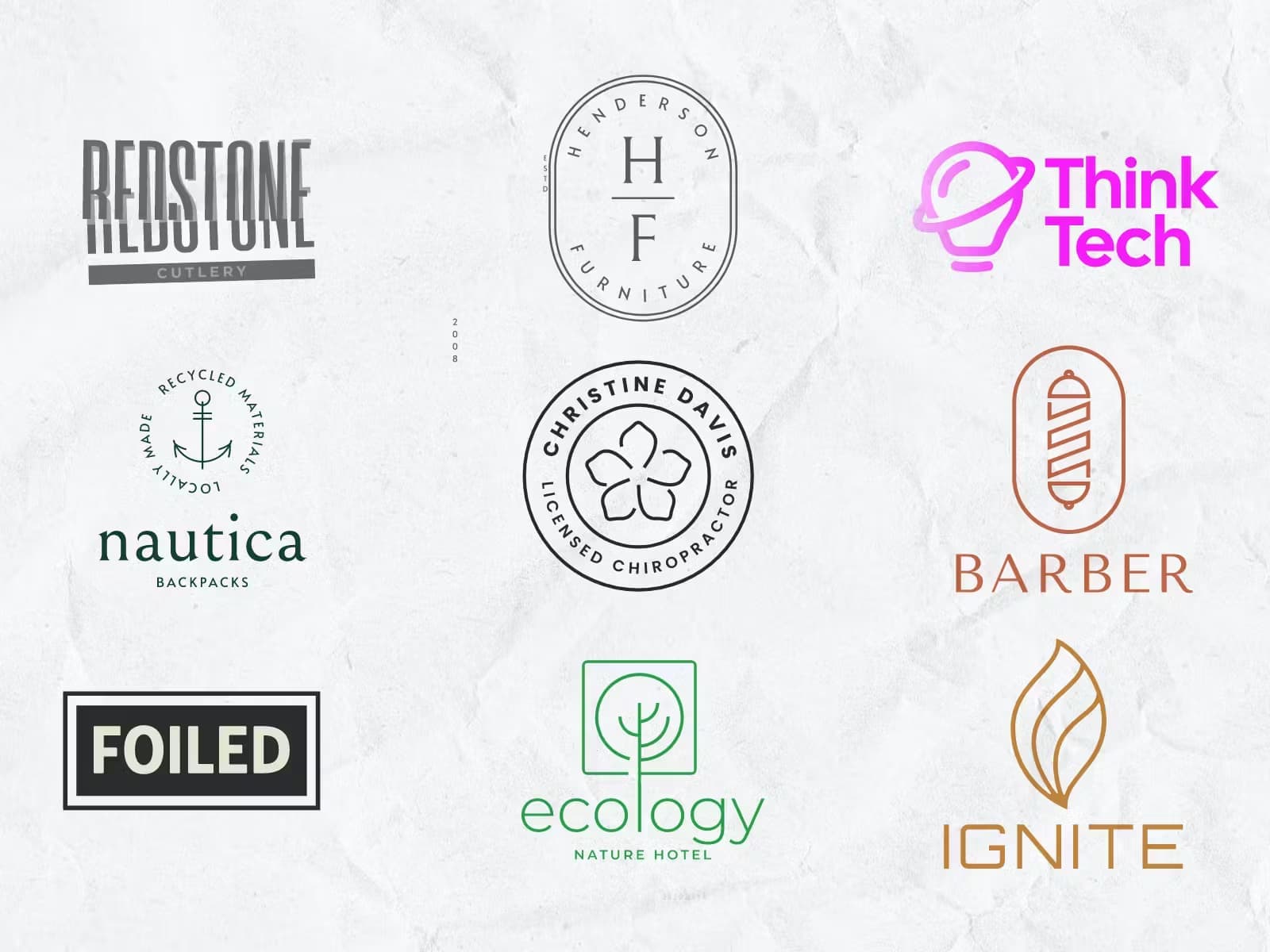
Source: kittle.com
Advantages of Less Is More in Logo Design
1. Memorable Simplicity:
Minimalist logos are often characterized by clean lines, uncluttered compositions, and uncomplicated shapes. This simplicity makes the logo more memorable and recognizable, allowing it to stand out amidst the visual noise of a crowded market.
2. Timeless Appeal:
Trends come and go, but minimalism endures. By avoiding flashy elements that may become dated, minimalist logos have a timeless quality, ensuring that they remain relevant and impactful for years to come.
3. Versatility and Adaptability:
Less Is More logos are incredibly versatile, adapting seamlessly to various mediums and sizes. Whether displayed on a business card or a billboard, their elegant simplicity retains its impact.
4. Visual Impact: ‘
By using negative space cleverly and placing emphasis on essential design elements, minimalist logos can create a powerful visual impact, drawing attention to the brand’s name or symbol in a captivating way.
5. Enhanced Brand Perception:
Minimalist logos exude an aura of sophistication, professionalism, and confidence. This positively influences how customers perceive the brand, instilling a sense of trust and credibility.
Disadvantages of Less Is More in Logo Design
1. Challenging Simplicity:
Achieving the right balance of simplicity can be challenging. Designing a logo with fewer elements means that every aspect must carry significance, requiring careful thought and creativity.
2. Subjectivity in Interpretation:
Due to their minimalistic nature, these logos may be open to various interpretations. While this can be an advantage in some cases, it may lead to misunderstandings or misrepresentations of the brand.
3. Competing with Complexity:
In a sea of visually complex logos, a minimalist design may struggle to grab attention. It requires careful execution to ensure that the logo communicates the intended message effectively.
Tips for Mastering Less Is More in Logo Design
1. Focus on Core Values:
Identify the core values and essence of the brand. Use this as a guiding principle to determine which elements are essential to the logo’s design.
2. Embrace Negative Space:
Negative space is a powerful tool in minimalist design. Explore ways to utilize it creatively to convey hidden meanings or add depth to the logo.
3. Typography Matters:
In minimalist logos, typography plays a critical role. Select fonts that align with the brand’s personality and pair them with simplicity and elegance.
4. Seek Feedback:
Minimalist designs can benefit from diverse perspectives. Seek feedback from stakeholders and target audiences to ensure the logo resonates with the intended message.
5. Test in Various Contexts:
Before finalizing the design, test the logo in different contexts and sizes to ensure its adaptability and impact across various mediums.
Embracing Less Is More in logo design can lead to a captivating and timeless visual identity for a brand. By skillfully balancing simplicity and significance, these logos communicate a sense of sophistication and elegance, leaving a powerful and lasting impression on customers.
Font Finesse: Enhancing Your Logo with Elegant Typography
Typography plays a crucial role in logo design—it’s the art of choosing and arranging fonts to convey a brand’s personality and message. When it comes to creating a logo that truly stands out, Font Finesse is your secret weapon.
This approach focuses on selecting fonts that exude elegance, professionalism, and uniqueness, elevating your logo to a whole new level of sophistication.
Advantages of Font Finesse
- Establishing Brand Identity: Fonts have the power to evoke emotions and associations. By carefully selecting a font that aligns with your brand’s values and personality, you can establish a distinct brand identity that resonates with your target audience.
- Creating Visual Hierarchy: Different fonts convey varying levels of importance and hierarchy. With Font Finesse, you can create a visual hierarchy within your logo, guiding the viewer’s eye to the most critical elements and messages.
- Adding Personality: Fonts come in a vast array of styles—from classic and timeless serifs to sleek and modern sans-serifs. Each font style brings its own personality to the design, allowing you to infuse your logo with the desired tone and character.
- Enhancing Legibility: While creativity is essential, readability should never be compromised. Font Finesse ensures that your logo remains legible even at smaller sizes or from a distance, making it versatile and suitable for various applications.
- Standing the Test of Time: Classic fonts used with finesse have a timeless quality, making your logo less susceptible to becoming outdated as design trends evolve.
Disadvantages of Font Finesse
- Overly Common Fonts: While classic fonts are timeless, some fonts have become so widely used that they may lack the uniqueness and distinction desired for a standout logo.
- Limited Flexibility: Depending on the font you choose, it may not work well across all applications and sizes. Some intricate or decorative fonts may lose their impact when scaled down or used in certain mediums.
Subjective Preferences: Font choice can be subjective, and what may resonate with one audience may not appeal to another. It’s crucial to strike a balance between your brand’s personality and broad audience preferences.
Tips for Mastering Font Finesse
-
Understand Your Brand:
Before diving into font selection, thoroughly understand your brand’s values, voice, and target audience. The font should reflect your brand’s identity and the message you want to convey.
-
Pairing Fonts:
Experiment with font combinations to create harmonious pairings. A common practice is to use a combination of a bold and attention-grabbing font with a more understated and elegant font to achieve balance and contrast.
-
Legibility Matters:
While decorative fonts can be tempting, ensure that your logo remains easy to read. Avoid excessively ornate fonts that might hinder legibility.
-
Keep It Simple:
Less is often more when it comes to typography. Resist the urge to use too many fonts in a single logo, as it can create visual clutter and diminish the overall impact.
-
Test Across Platforms:
Test your chosen fonts across different mediums, such as digital screens and print materials, to ensure consistent legibility and impact.
Remember, Font Finesse is about striking the perfect balance between creativity and practicality. With the right font, your logo will captivate your audience, leave a lasting impression, and serve as the cornerstone of your brand’s visual identity.
So, let your words do the talking, and let Font Finesse elevate your logo design to new heights of elegance and professionalism.
Monochrome Magic
Monochrome Magic is a design approach that relies solely on the use of black and white colors in a logo. It is a minimalist and timeless style that captures attention and conveys a powerful message without the need for multiple colors.
The beauty of monochrome lies in its simplicity and elegance. By eliminating color distractions, the focus is solely on the logo’s form, shape, and composition.
The contrast between black and white creates a striking visual impact, making the logo stand out in any setting, whether it’s on a business card, a website, or a billboard.
One of the key advantages of using a monochrome logo is its versatility. Black and white logos can seamlessly adapt to various mediums and materials, ensuring a consistent and recognizable brand identity across different platforms.
Whether the logo is printed in high resolution or displayed in a small size, it retains its clarity and impact.
Moreover, monochrome logos can transcend trends and time. Unlike colorful logos that may be subject to changing preferences or outdated styles, monochrome designs remain relevant and sophisticated throughout the years.
They exude a sense of class and professionalism that can appeal to a wide range of audiences.
Monochrome Magic also allows for clever use of negative space, where the absence of color is employed to create clever illusions or hidden symbols within the logo. This creative technique adds an element of intrigue and mystery, inviting viewers to discover deeper meanings within the design.
When creating a monochrome logo, attention to detail becomes crucial. The focus shifts to the balance between light and dark, the intricate lines, and the overall composition. Each element must be carefully considered to ensure that the logo communicates the intended message effectively.
Hidden Messages
Hidden Messages in logo design refer to the practice of incorporating subtle elements, symbols, or meanings within a minimalist logo that may not be immediately apparent at first glance.
It’s a creative way for designers to add depth and intrigue to a logo, inviting the audience to engage in a form of visual discovery and creating a special connection with the brand.
Think of it as a clever game of hide and seek, where the logo designer strategically places hidden symbols or messages within the design. These elements may not be obvious to the casual observer, but once discovered, they add an extra layer of meaning and storytelling to the logo.
The beauty of Hidden Messages lies in the surprise factor. When someone uncovers the hidden element, it creates a sense of delight and curiosity, forging a unique bond between
the brand and its audience. It’s like sharing a secret handshake—an intimate connection that makes the audience feel special and included.
Designers can incorporate Hidden Messages in various ways. One common method is using negative space, where the absence of design creates a shape or symbol.
For example, the FedEx logo cleverly hides an arrow between the “E” and “x,” symbolizing speed and precision in their delivery services.
Another technique is using symbolic imagery that holds significance to the brand’s values or story. This could be a subtle reference to the company’s history, mission, or industry. What is symbolism?
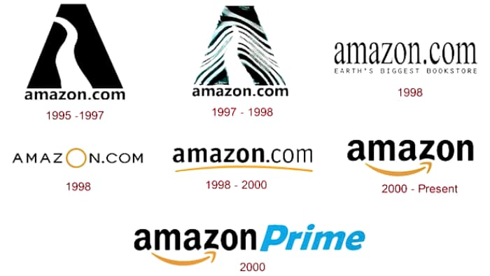
Let’s take the example of the famous logo of “Amazon,” a multinational technology and e-commerce company.
Amazon Logo: Symbolism and Hidden Message
The Amazon logo features a simple and iconic design with an arrow connecting the letters “A” and “Z.” At first glance, it may appear to be a smiley face, but there’s more to it than meets the eye.

Symbolism:
Arrow: The most prominent element of the logo is the orange arrow that starts from the letter “A” and points to the letter “Z.” This arrow serves a dual purpose. Firstly, it represents a smile, signifying the company’s commitment to customer satisfaction and providing a pleasant shopping experience. Secondly, the arrow symbolizes the flow of products from “A” to “Z,” indicating that Amazon offers a vast range of products, from the beginning of the alphabet to the end.
Connecting Letters: The arrow not only connects the letters “A” and “Z” but also creates a seamless and continuous flow within the word “Amazon.” This signifies the company’s dedication to providing a smooth and seamless shopping experience to customers, from browsing to delivery.
Hidden Message:
The clever use of negative space in the Amazon logo reveals another hidden message. If you look closely at the logo, you’ll notice that the arrow also forms a subtle smile, suggesting the idea of customer satisfaction and delight.
It’s a subtle yet powerful way of conveying that shopping with Amazon brings joy and happiness.
Advantages of Symbolism in Logo Design:
-
Memorability:
Symbolism adds an extra layer of meaning to a logo, making it more memorable and distinct. When people understand the symbolism, they are more likely to remember and recognize the logo.
-
Storytelling:
Symbolic logos can tell a story or convey a message about the brand’s values, mission, or unique selling points. This helps to create a deeper connection with the audience.
-
Simplicity:
Symbolic logos often use simple and minimalist designs, which are visually appealing and easy to reproduce across various platforms and sizes.
-
Versatility:
Symbolic logos can be versatile, as they can be used with or without accompanying text, making them adaptable for different marketing materials and contexts.
Disadvantages of Symbolism in Logo Design:
-
Misinterpretation:
If the symbolism is too obscure or not well-executed, there is a risk that the audience may misinterpret the intended message or not understand the hidden meaning.
-
Cultural Sensitivity:
Symbols can have different cultural interpretations, and what may be positive in one culture could be negative in another. Brands with a global presence need to be mindful of cultural differences.
Symbolism in logo design adds depth, meaning, and storytelling to a brand’s identity. It allows logos to convey powerful messages and create a memorable impression on customers.
When used effectively, symbolism can make a logo stand out and become an iconic representation of the brand.
However, it’s essential to strike a balance when incorporating Hidden Messages. The primary purpose of a logo is to communicate the brand’s identity clearly and memorably.
If the hidden element is too obscure or difficult to notice, it may overshadow the logo’s main message, which could be counterproductive.
When done right, Hidden Messages can add an element of intrigue and memorability to a minimalist logo. It sparks curiosity, encourages engagement, and leaves a lasting impression on the audience.
It’s an excellent way for brands to create a deeper connection with their customers and establish a sense of loyalty and appreciation.
Overall, Hidden Messages are a creative and effective tool in logo design, allowing brands to tell a more profound and meaningful story while still maintaining the simplicity and elegance of a minimalist approach.
Designing for Business Success
-
Know Your Audience
Alright, time for the nitty-gritty. Who are you talking to? Understand your audience, their quirks, and what makes ’em tick. Then, create a logo that’ll tug at their heartstrings!
-
Brand Your Logo
Your logo’s like a superhero in disguise—it embodies your brand’s essence! Make sure it flaunts your brand’s mission, vision, and personality loud and proud.
-
Size Matters
Big or small, your logo should dazzle on any stage! From towering billboards to teeny app icons, your logo’s got to be versatile and rock it everywhere!
-
Timeless Appeal
Trends may come and go, but your logo? Oh, it’s got to be timeless! Choose design elements that’ll stand strong through the ages. No shortcuts, friend!
The Creative Process: From Concept to Reality
Step 1: Research and Brainstorming
Gather ’round, it’s time to dive deep! Look at what’s hot, what’s not, and what’s lighting up the logo world. Let those creative juices flow, and start brainstorming like there’s no tomorrow!
Step 2: Refine Your Ideas
Alrighty, folks, it’s time to sift through your brilliant ideas and pick the golden ones. Get some feedback, toss around thoughts, and polish those gems!
Step 3: Digitalization and Design
Now we’re talking tech! Get your tools ready, fire up those vector-based software like Adobe Illustrator, and give your logo the digital magic it deserves.
Step 4: Test Your Logo
Woah, hold up! Don’t hit print just yet. First, let’s see how your logo rolls in the real world. Test it on different materials, products, and platforms. It’s like a logo dress rehearsal!
Colors That Pop: Making Your Logo Stand Out
When it comes to creating a memorable logo, colors play a pivotal role in capturing attention and leaving a lasting impression. Colors That Pop is a design concept that emphasizes using bold and vibrant hues to make the logo visually striking and attention-grabbing.
The goal is to create a logo that demands to be noticed, engaging the audience and forging a strong connection with them.
Advantages of Colors That Pop in Logo Design
1. Increased Visibility:
Vibrant and eye-catching colors naturally draw the eye. A logo with Colors That Pop stands out in a sea of competitors, making it easier for customers to spot and recognize the brand.
2. Expressive Branding:
Colors have the power to evoke emotions and convey brand personality. By selecting the right combination of colors, a logo can communicate the brand’s values, energy, and identity effectively.
3. Memorability:
Human brains are wired to remember bright and distinct colors. A logo with Colors That Pop is more likely to stick in the memory of potential customers, increasing brand recall and recognition.
4. Positive Associations:
Specific colors are associated with certain emotions and qualities. By strategically using Colors That Pop, a logo can create positive associations with the brand, fostering a favorable perception among consumers.
5. Versatility:
Colors That Pop can be utilized in various marketing materials and advertisements. The logo’s vibrancy translates well across both digital and print media, ensuring a consistent brand presence.
Disadvantages of Colors That Pop in Logo Design
1. Overwhelming Design:
While bold colors can be attention-grabbing, using too many vibrant hues or using them haphazardly may lead to a visually overwhelming logo. It’s essential to strike a balance and maintain harmony in the design.
2. Cultural Significance:
Colors can carry different meanings and cultural associations. What may be perceived positively in one culture could have a negative connotation in another. Researching the cultural significance of colors is crucial, especially for brands with a global audience.
3. Trend Dependence:
Vibrant color schemes may be trendy at a particular time, but trends change. A logo is solely reliant on Colors That Pop may risk looking dated when trends evolve.
Tips for Effective Use of Colors That Pop
1. Know Your Audience:
Understand the preferences and cultural background of your target audience to select colors that resonate with them.
2. Color Psychology:
Research the psychological impact of colors to ensure your selected palette aligns with the intended brand personality and messaging.
3. Color Harmony:
Create a visually harmonious logo by balancing vibrant colors with neutrals or complementary shades.
4. Consider Brand Identity:
Select colors that reinforce the brand’s identity and are aligned with its mission and values.
5. Test on Various Platforms:
Before finalizing the logo, test its appearance on different platforms to ensure the colors maintain their impact and readability.
Colors That Pop is a powerful design choice for logos, as it grabs attention and sets the brand apart from competitors.
When used thoughtfully and strategically, bold and vibrant colors can enhance brand recognition, create positive associations, and foster a strong connection with the audience.
Conclusion
Whoa, you made it! The realm of modern, minimalist, and business logo design awaits your genius. Armed with these kickass tips, you’re ready to create logos that’ll rule the design kingdom.
Remember, a logo isn’t just a pretty picture—it’s the face of your brand. So, let your creativity shine, let your brand values soar, and create a logo that speaks volumes about your business.
Now go on, design Rockstar’s, and show the world your logo magic! Happy designing!
Frequently Asked Questions (FAQs)
Q1: Can I design a killer logo without being a design guru?
You betcha! Passion and determination are your trusty sidekicks. Plus, online tools and resources are your design besties!
Q2: How many colors are too many for my logo?
Keep it snazzy, but not chaotic! Three colors are just right to make your logo a total head-turner.
Q3: How do I make my logo timeless?
No time for fads! Stick to classic design elements that’ll age like fine wine.
Q4: Is it better to go for a detailed or minimalistic logo?
Ah, the classic dilemma! It depends on your brand and the vibe you’re aiming for. Detailed logos dazzle, while minimalist ones wow with simplicity. Choose wisely!
Q5: What file formats should I use for my logo design?
Keep it flexible! Save your logo in vector formats. AI or. EPS for smooth scaling, and. PNG or. JPG for web and print adventures.
Q6: How do I ensure my logo represents my brand values?
Oh, it’s like soul-searching! Dive deep into your brand’s heart and let its personality shine through your logo.
Q7: What should I avoid when designing a logo?
No clichés, no confusing clutter, and no going overboard with design acrobatics. Keep it clear, simple, and unforgettable!
Q8: Can I trademark my logo design?
Absolutely! Protect your logo like a champ. Once it’s all set and ready, get legal advice and trademark that beauty!
Q9: How can I make my logo stand out from competitors?
Uniqueness is the name of the game! Find what makes your brand one-of-a-kind, and let that be the star of your logo.
Q10: What if I’m not happy with my logo after completing the design process?
No worries, amigo! Take a breather, gather fresh perspectives, and don’t hesitate to give your logo a makeover.

